3D user experiences for 2D content environments
Exploring content structure on a third axis; paradigms of depth and the topography of three dimensional digital experiences in increasingly connected, two dimensional environments.

Exploring content structure on a third axis; paradigms of depth and the topography of three dimensional digital experiences in increasingly connected, two dimensional environments.
In 1989, Tim Berners-Lee invented the World Wide Web, otherwise known as The Web, www or simply the interwebs. I understand the web metaphor, after all it is a mass global network of interlinked URLs and an estimated 5 billion indexed pages but today, nearly 30 years later, the metaphor as an experience falls short. Not because you’re no longer reading this on a web, of course it’s a web, but when we choose to give something a name it frames how we understand it.
In Aspen, 1970, Richard Saul Wurman said:
“One understands information only relative to some piece of information he already understands.”
Our past experience of webs shape how we perceive our use of the internet.
Webbed experiences do not suggest proximity, while our experience of the internet does. At the inception of the web, we drew lines like flight paths around the globe to demonstrate these miraculous transfers of data and the thousand mile journeys of discovery, interaction and spider-webbed connectivity open to us. In 2017, these experiences seem instantaneous, they suggest proximity; as we follow a link, we don’t wait in line or board a plane, we walk through a door to an adjacent room or building. The web and the net describe the structure but they do not adequately describe the experience because our digital experience is dense, urban and contiguous.
The internet is a city; a million places and spaces proximate to each other, a living entity of countless bits of content dancing to the same song.
The immediacy of the hyperlink does not transport me to the other side of the world; long gone are the days of brewing coffee to dulcet dial-up tones and packing up the Netscape Navigator for extended rural journeys, but we have all experienced the immediacy of travel in the city. We have walked her streets and found refuge in her parks. We have skipped across her for meetings, protested in her public avenues, breathed her smog filled air and marvelled at the beauty of her choreography and her million instantaneous interactions.
I know the city is a webbed infrastructure, so why does this urbanised experience matter? Because human beings have architected and refined the experience of the city for millennia. We have built, failed, rebuilt, suffered catastrophe, invaded, been invaded and innovated to meet the needs of 54% of humankind who live in close proximity to each other. As architects of connected digital experiences, what lessons can we learn from the history of the city? Which metaphors transfer and what innovations have transformed the urban experience?
I’d like to start with one.
Architects and designers have been building up for almost as long as they have been building out, while bar a few minor forays into expressing depth, we are the Kings and Queens of the digital bungalow. We, the architects of digital space, create single layered journeys, ushering users through delightful experiences like Daleks of the sixties unable to climb the stairs of possibility.
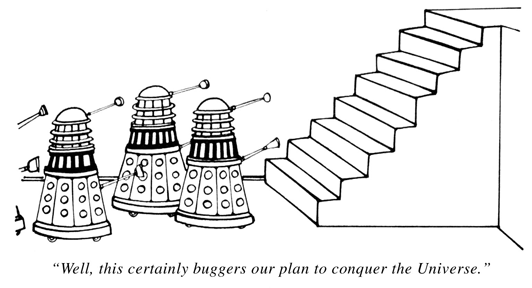
Peter Birkett (Punch magazine)
Creating digital layers of content has primarily been reserved for maps: pinning locations and businesses, overlaying traffic and discovering global radio stations. Soundcloud users are invited to comment atop audio waveforms, Amazon’s X-Ray tells us which characters are involved and what song is playing at any given moment and downloadable browser plug-ins offer us political commentary atop our online experience.
Conversely, creating physical layers of content has dramatically transformed the city, her skyline and our experience of her forever.

The Manhattan Skyline (1876 - 2013)
The world’s first modern “skyscraper” was the Home Insurance Building in Chicago. Standing at 138 feet and 10 floors, it was the tallest building in the world from its completion in 1884 until 1889 and was made possible by the revolutionary use of an inner steel shell. People were able to navigate this monolithic structure thanks to the use of rudimentary elevators that transported them up and down between the layers.
Co-founder of Kore, Juls Hollidge, says:
“Structure is that which will hold you.”
And much like the experimental architects of the late 19th and early 20th centuries, we deal in the same materials; concerned with the structures that hold us, the access to them and the creation of simple, delightful routes for the those who are held by them.
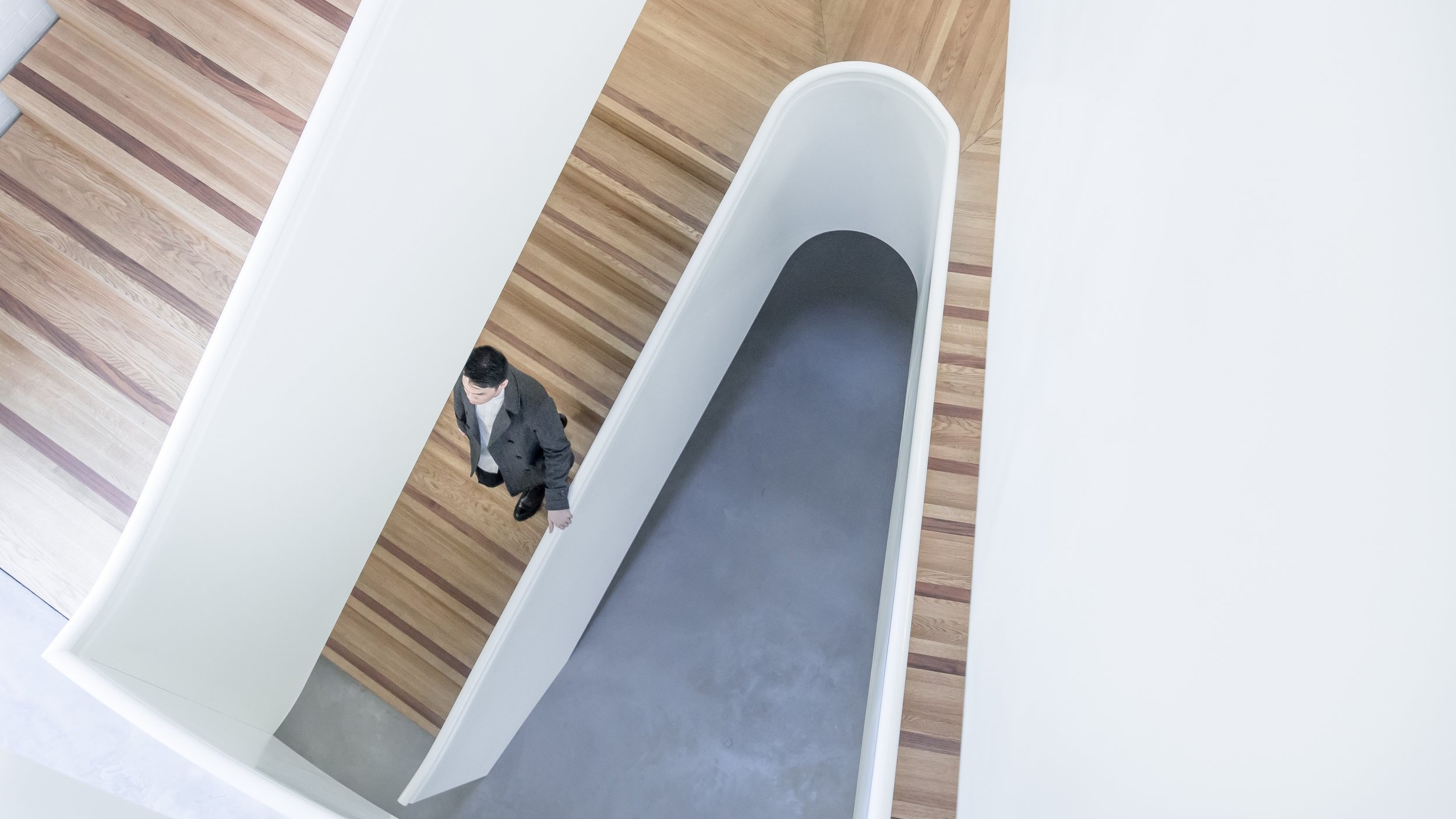
Tall, sky scraping structures were made accessible by the innovation of the elevator, transforming the possibility of experience on a vertical axis. Until the mid 19th Century, buildings were only built to a height of around six floors; limited by cumbersome stone structures that risked falling in on themselves six floors was deemed by some as the point that a person climbing stairs would eventually drop their shopping bags in exhaustion.

PIVOT meme from NBC / Warner Brother’s F.R.I.E.N.D.S
Elisha Graves Otis invented the reliable safety brake in 1852, and although largely overlooked by his immediate contemporaries, his invention made travelling in lifts safe. It allowed multiple users to share a journey and paved the way for buildings of up to 30 floors by the early 20th century.
The company that bears his name is one of the ‘big four’ elevator companies in the world today, a name that dwells deep in our subconscious as we daily cross the threshold of lift doors and escalator walkways adorned by his surname.
The upper floors of buildings were once reserved for the poor and working classes, subject to the exertion of climbing stairs. The invention of the elevator transformed architecture and transformed society, enabling the penthouse, top floor and corner office as desirable status symbols for the rich and successful.
Building upward is not only a pursuit of riches but also an ethical imperative for many; limiting urban sprawl, protecting the environment and providing an answer to more sustainable ecosystems for a global population experiencing increasing density. Patrick Moore, Co-founder of Greenpeace says:
“We need to draw lines in the ground and say, the concrete stops here. That forces people to build in and up, rather than out — and there’s nothing wrong with high, dense urban environments as long as they’re planned correctly. They can be extremely liveable. They tend to require less transportation, fewer sewer lines, fewer power lines, fewer roads, and more tightly packed structures, which in and of themselves are more energy efficient.”
The skylines and experiences of our cities have been forever transformed by super structures and the elevators that service them and I’d like to propose that in a digital environment with ever increasing and, most importantly, ever connected content, we could learn from our urban architectural counterparts and build up for a different kind of contextual digital experience.
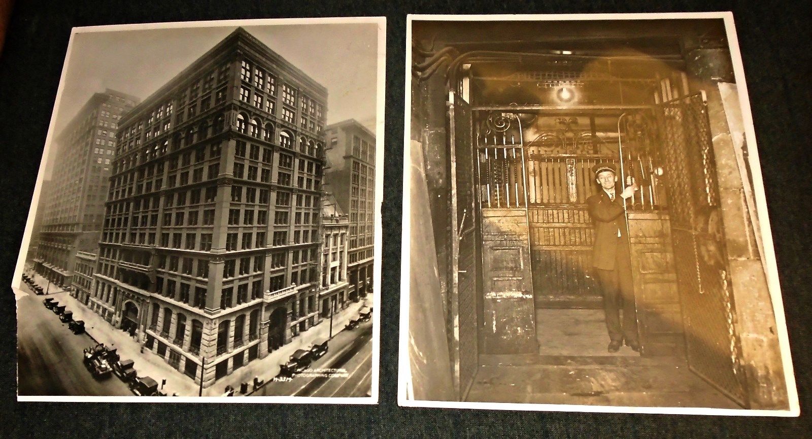
Vintage photos of the Home Insurance Building, Chicago
The wireframes we draft often look like architectural floor-plans as we create another page or another screen for each room. Dan Klyn has wonderfully explored applying the architectural staples of drawing plans, sections and elevations to sitemaps and other IA deliverables.
Paul Rissen has also explored storytelling via the possibilities offered to us by the webbed structure of the internet, talking about the narrative construct of split-screen employed by the political thriller, 24.
As I reflect on these two thoughts, I cannot help but think that the architectural section offers us the perfect vessel to express split-screen narratives in digital space.

Levy, Alan, William B. Chapman, and Richard S. Wurman. Our Man-Made Environment: Book Seven. Philadelphia: Group for Environmental Education, 1970. HT Dan Klyn

24: splitscreen — 20th Century Fox
The section provides a view of a building sliced vertically, demonstrating the relationship between levels. The splitscreen provides a view of time sliced personally, demonstrating relationship between experiences.
Our digital city is becoming more and more populated with inhabitants and content. Every minute of the day 400 hours of new video is uploaded to Youtube, 9,768 emoji filled tweets are sent and 2.4 million photos are liked on Instagram. This content and associated ‘Big Data’ is increasingly connected to other content, not just via the URL but by theme, location, metadata, time of publication or by being a direct piece of commentary on something or someone else. The web is ever more intricate and complex, so like Kiefer Sutherland’s splitscreen that gives us insight and context for multiple congruent data sources, could we also arrange digital content vertically like floors in an architectural section.
If we are able to isolate suitable ground floors in our digital city, we can create experiences that arrange, create and collate further content in the floors above it. Every level mapped to the footprint of the ground floor, creating a user experience that wherever one finds themselves, on any given floor, they are afforded context by knowing the basic footprint of the building. Structure is that which can hold you and a structure with multiple floors offers new possibilities for digital navigation and contextual wayfinding.
Without building up, our choice as architects is generally limited to building out. Without depth, adjacency becomes our tool of choice and all of us have experienced websites that are the opposite of delightful thanks to an overcrowded ground floor. Sites where every piece of available space has been commandeered for associated links, related articles, ads, comments and because you watched 24 you might like Designated Survivor. Every urban planner will tell you that it’s not a good idea to fill every available piece of space and to consider the value of our unbuilt common spaces. Just consider the potential footprint of the building that currently holds, or has most recently held, you if it were to be a single floor.
I recently visited the Natural History Museum with my two year old, dinosaur-crazy son.
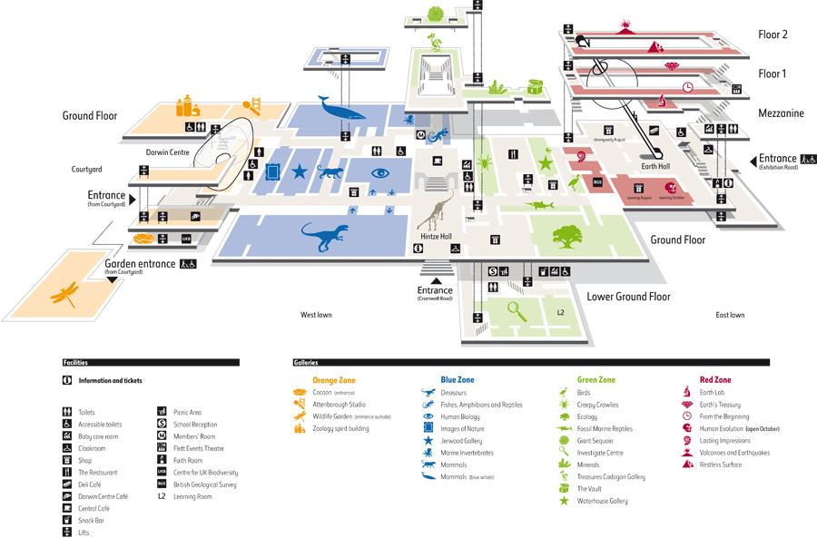
Map of Natural History Museum, London (UK)
This map allowed us to navigate the rooms and floors. The wayfinding techniques employed by the Museum (elevators, entrances, zones, wings, colours) gave us an intrinsic understanding of the structure that held us and allowed us to explore far more content in context than we would have been able to had the museum’s exhibits been crammed into a single floor or scattered across multiple South Kensington buildings.
The elevator, the mechanism that transported us between floors, provided context at all times. The lift shaft acts as an immovable navigational anchor, and like the North Star for a sailor, were I to follow the lift shaft to the ground floor, exit and turn right I would once again find myself in Hintze Hall.
The elevator provides the perfect example of recognisable design signifiers and affordancy as explored by Donald Norman in The Design of Everyday Things. The navigation tools of the elevator are, more-or-less, identical around the world and so, when we look to explore digital experiences of depth, we are provided with Norman’s intuitive guidance present within the design. Anywhere on the planet, I can walk into a small metal cubicle and I know what to do. I am presented with the instantly recognisable user experience of numbers on buttons, a G button (perhaps identified in a different colour), buttons with arrows and lines to signify ‘open doors’ / ‘close doors’ and an alarm bell. Norman says this of design:
“One way of overcoming the fear of the new is to make it look like the old. This practice is decried by design purists, but in fact, it has its benefits in easing the transition from the old to the new.”
When exploring new user interfaces or digital navigation techniques, designers are always faced with the complicated task of creating reference points; affordancies that say I know what happens when I push or when I swipe right. The elevator provides a language for vertical navigation that is waiting to be co-opted for the vertical navigation of the internet. Take, for example, this beautiful vertical transportation map of Taipei 101, the world’s tallest building from 2004–2009. Multiple floors mapped to the footprint of the ground floor and colour coded elevators that demonstrate accessibility and classification.

Taipei 101 Vertical Transportation Map
When we map experiences and predict or track digital user journeys, we borrow visual techniques from two dimensional maps, like the pedestrian foot traffic of Bank Junction below. Imagine the possibilities for mapping user journeys in a three dimensional digital structure. Data that would not only chart the direction of travel but the cartography and topography of a user’s journey like explorers scaling a mountain.

Bank Junction, London, pedestrian analysis (weekday 08:00–09:00) TFL 2016
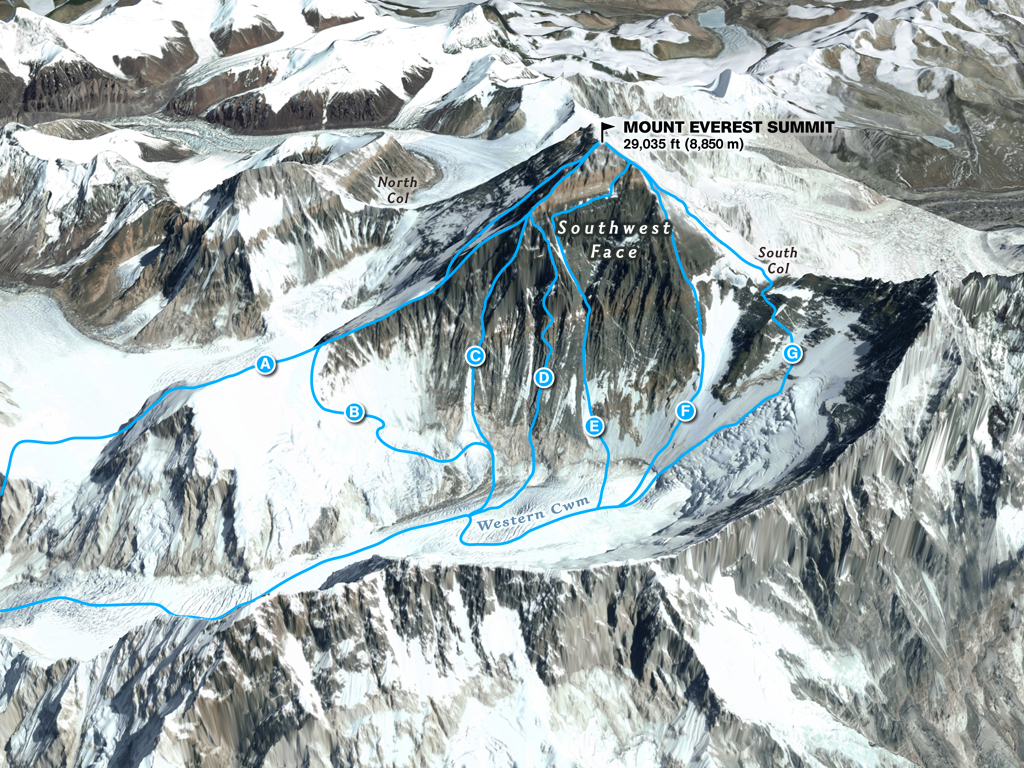
Mount Everest, routes to summit
User interfaces have historically only allowed for intuitive two dimensional journeys: the mouse, the trackpad, the click, the swipe, the tap. The pinch begins to explore a third dimension while the joystick could have further three dimensional application outside of gaming and warfare. The future of the internet (indeed the present) provides new three dimensional UI opportunities that we have yet to scratch the surface of: gestural communication, pressure, augmented reality, VR, wearables, AI, bots, holograms, altimeters, TR (Tactile Reassurance). And so, we are presented with the opportunity of creating structures that hold us and our content, intuitively capable of responding to these three dimensional expressions.
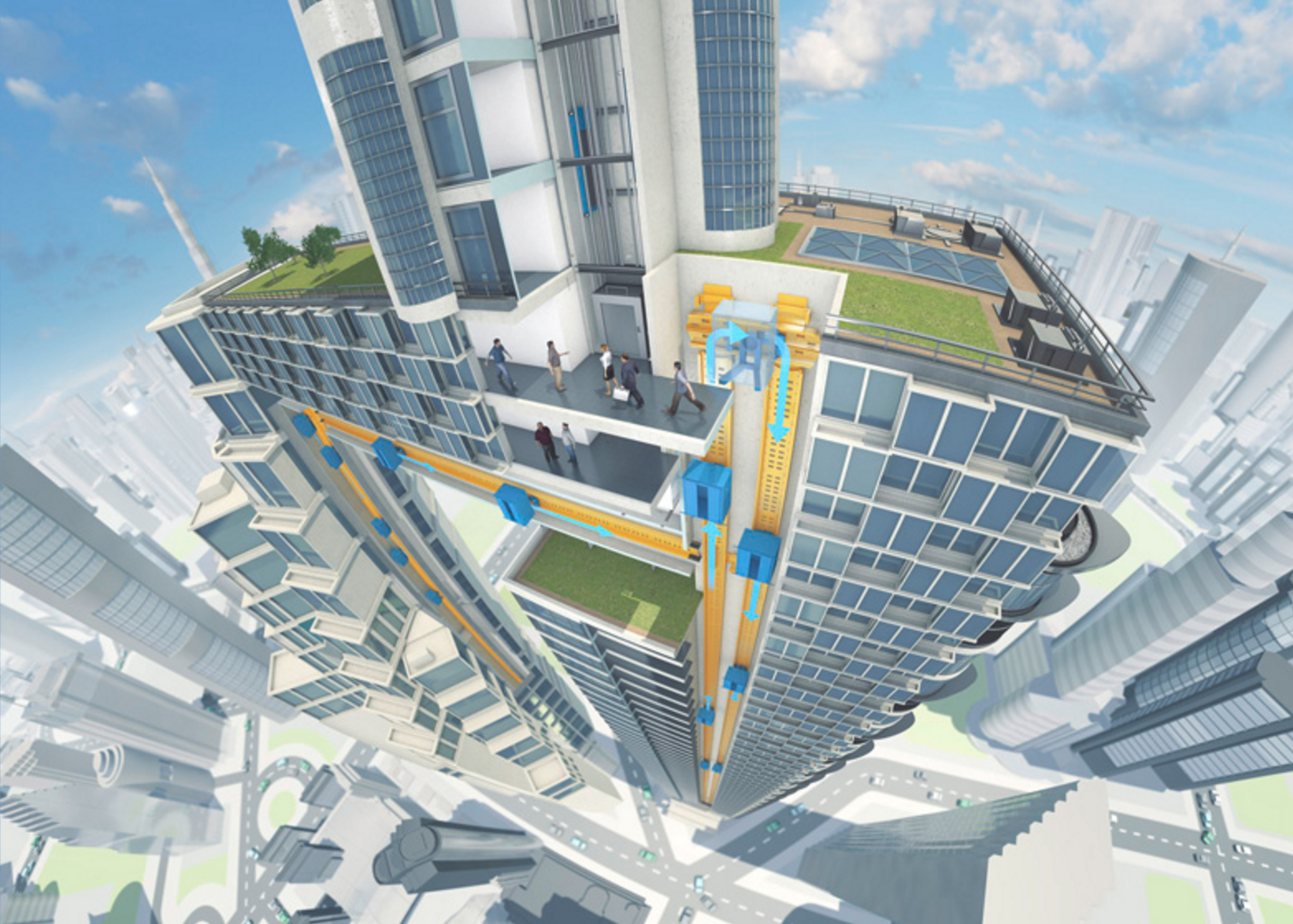
In recent years, the elevator has been much maligned, requiring too much floor space, incapable of reaching the entire height of super structures without staggering lift shafts and asking users to alight midway. This is however not the future of the technology.
Borrowing from the record-breaking magnetised speed trains of Japan and Transrapid, the German monorail system, the future of the elevator is magnetic. Lift shafts that employ magnets will require half the floor space, will allow for multiple cabs within the same shaft and will be able to move horizontally as well as vertically.
Like Elisha Graves Otis whose braking system sent us to higher heights and the companies exploring the future of magnetic travel within physical structures, the tools before us present an opportunity to reimagine the structures of the digital city.
The possibility of contiguous spaces of co-habitation and co-experience, split-screened in the context of a single structure remind me of my first time watching Paris bend in on itself in Christopher Nolan’s Inception.

Inception: Christopher Nolan, Warner Bros 2010
This proposed paradigm of layered web depth offers new and exciting possibilities for a crowded, content-full city and rather than leave it in theory, at Kore, we’re actively researching and developing strategic models, code and products that could put this theory into three-dimensional digital practice.
Welcome to the city.